Opinion: Your font choice matters
March 24, 2019
Once again, you’ve procrastinated writing your essay that’s due at 11:59. You only have a few hours to write six pages, but you’re in luck. Your professor never said you had use Times New Roman. You quickly hit the drop down menu and select the thickest 12 point font that’s going to turn those 5 1/2 pages into six. It gets you through this assignment.
In the moment, your font choice seemed decent. It filled a purpose and you didn’t even have to think that much about it.
However, ask anyone who’s taken a design class and they can tell you that your font choice can completely make or break what you’ve created.
You’ve chosen what will fill your page in a matter of seconds, but there are people whose careers are based on perfecting fonts and laying out every letter on a page. It’s a field of design called typography, and it’s really difficult.
I won’t get into everything that goes perfecting the type. In fact, there’s two semesters of foundational typography courses that every design student at Loyola has to take. It’s that important.
So why does typography matter?
Every font serves a different intended purpose and meaning. Some are sleek and ultra modern. Others are fun and quirky. Still others are professional and serious.
I wouldn’t sign a contract nor would I want my professors to give a test written in Comic Sans. Nor would I be interested in going to concert that used Times New Roman on the poster. You fonts should match the level of seriousness of your project, otherwise, it’s ineffective.
Sometimes fonts are chosen for readability or clarity rather than personality. That’s why 12-point Times New Roman became the standard for essays and why Helvetica is used on all U.S. road signs.
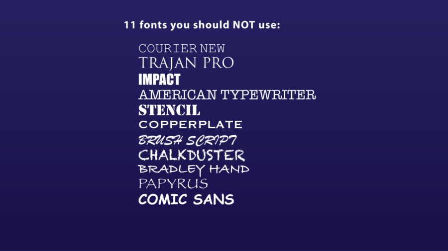
It’s also a good idea to stay away from the list of “banned” fonts that designers refuse to use such as, Comic Sans, Papyrus, Impact, Curlz MT, etc. If it came standard on Microsoft Word 97, it’s probably really played out by now. Elevate your work by staying away from using them on any of your club flyers or class presentations.


