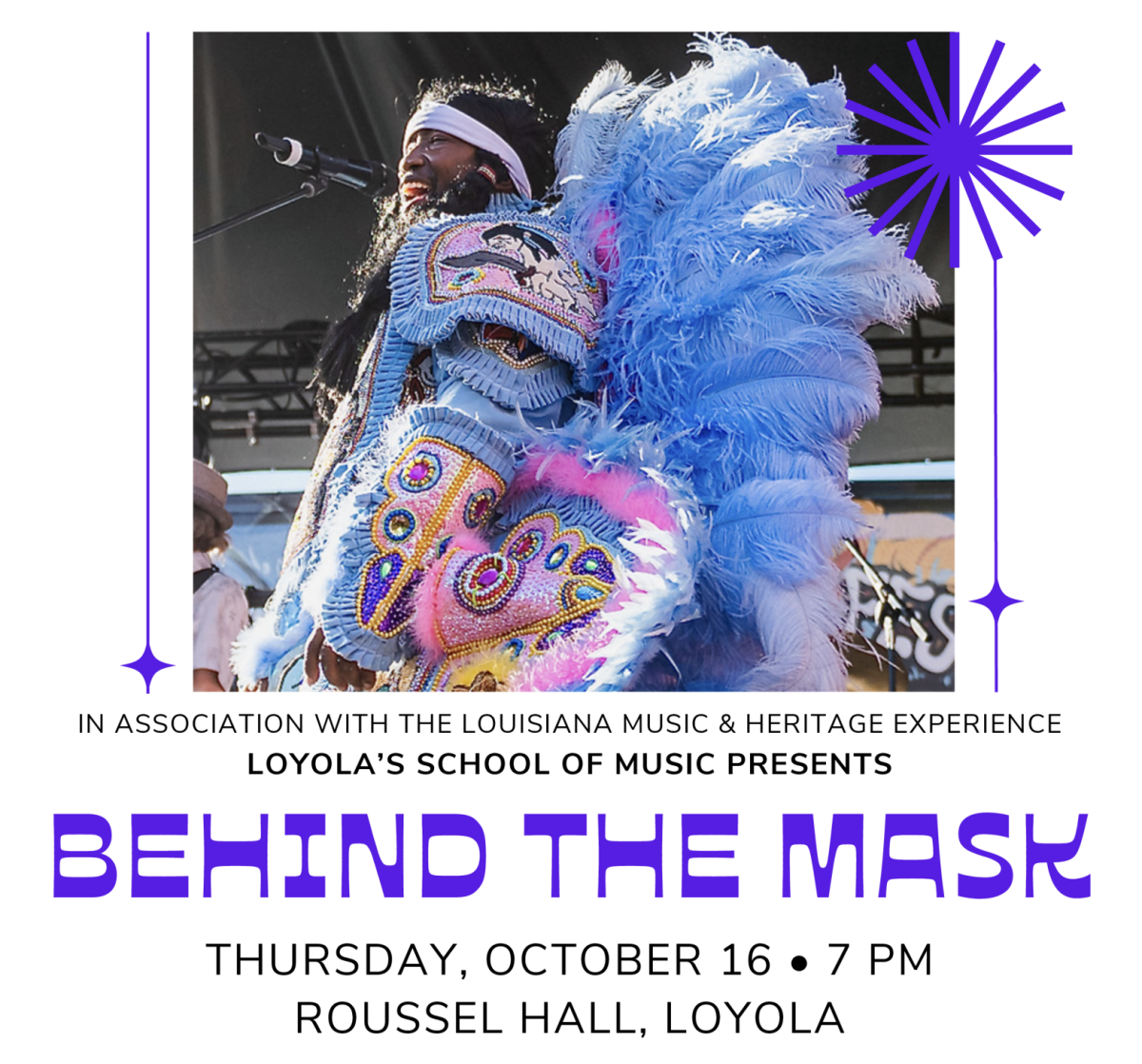
Loyola University hosts many events on its campus each year. Parents, New Orleans residents, colleagues and friends flock to the campus for a wide range of activities — art galleries, classical music concerts, plays, athletic events, lectures, private events and even to use the Monroe Library.
People travel to the university and spend their time on campus for whatever reason they may have.
And yet, I have seen people frustrated and upset as they tried to find where they needed to go, late for their meeting or concert.
Regardless of the small size of this campus, people continue to get lost. Loyola suffers from a lack of signs that make it hard for visitors and students alike to get around campus.
I pay particualar attention to intricate detail. Smaller details may add up to the bigger picture – making improvements to Loyola’s already excellent campus.
Clear communication through signs would be an important step in improving the university.
This fall semester I have been taking a course on business communications. This course focuses on how to communicate with others clearly and effectively.
By communicating effectively there can be more efficiency and a greater sense of professionalism.
Having a campus that communicates messages clearly shows that we have our act together, know what we are doing and how we should do it – good qualities to have in the working world.
There are some examples of clear communication, such as the university’s e-mails.
I sometimes glance at the Daily Digest e-mails in my Loyola Webmail inbox to see if there is anything interesting going on around campus.
And through the BOLO BOLO e-mails I know what I should look out for to remain safe in New Orleans.
But there are still places for improvement.
This past summer I was a new student orientation leader, and I was given the task of placing signs around campus to identify each building and to direct new students to where they need to go.
Prospective students and visitors are looking for a place to park and a particular building on campus, and the university needs more signs to help them.
Maps should be placed around campus so people know where Nunemaker Hall is, the Art Gallery, or where the Admissions Office is.
Signs should be posted on buildings indicating their names. For example, Carrolton Hall and Biever Hall both need signs, and Buddig Hall’s sign needs to be updated.
People should know what the names of the streets that run through Loyola. We can also communicate clearly by placing a menu in front of the Orleans Room to show what is being served for a particular meal.
This also applies to the traffic on campus. I recently received a parking ticket for “parking over the yellow line.” Guidelines should be placed (with some limitation) indicating the rules of the parking garage so officials may refer back to those signs in resolving a discrepancy.
I would assume that people would heed to the signs and not park over the lines if the message were clearly written. Yellow lines should be bright and distinct to cause no confusion between faded black lines and bright yellow lines.
If messages are being communicated clearly, people will understand what is being said and be able to take issue with the policy.
Brandon Toy is a general studies business junior. He can be reached at [email protected]
In My Opinion is a weekly column open to any Loyola student. Those who are interested can e-mail [email protected]


