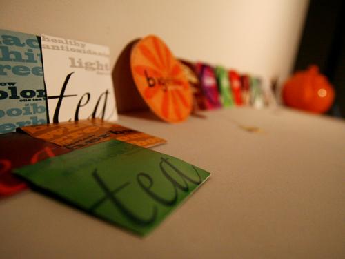
From April 20 to April 23, the Graphic Design Senior Show was displayed at Diboll Art Gallery in the Monroe Library. The show featured the final senior projects through individual installations and a display of their projects during the past year.
Shelly Jenkins’ movie “Where is My Cell Phone?” is light and entertaining. He takes size to experimental levels. Jo Peters’ project was straight forward and chic, with sarcastic images in a journey through blonde, red and brown hair. Linda Phan’s “LoveHate” project featured a double-sided book and cards with stenciled, clear plastic for inclusive shadow art, all in a classic Roman style focusing on mythology.
Eliza Schulze’s parachute presentation included a real parachute, painted with figures and hung in a corner of windows, allowing for sun to beam through. Within the parachute, a video was projected on the parachute that addressed Schulze’s childhood dreams of parachutes. She asks the viewer what images they associate with the parachute they were under. Included with the parachute were a selection of parachute men toys to drop from great heights, and two large tapestries that used simple typeface to tell the “History of the Parachute,” and the “History of this Parachute.”
Martha Heatherington’s environmental art turned three white walls into a non-recurring pattern of black shapes of amazing creatures with the message, “30,000 Species Go Extinct Every Year.” She also offered a huge collection of informational cards about animals that have disappeared; their shapes on the front side with forceful red “X’s.”
The yearly projects displayed developmental and comparable works with specified projects. Standing out among the projects was Shelly Jenkin’s 1960s color pallets on a Grateful Dead inspired main poster with a skeleton in frilly, Victorian fashions. For a project titled “Fried,” he featured the band Funk.Soul.Family. with Michael Franco’s frizzy hair as the centerpiece. Eliza Schulze also made a statement with a Seuss-like style for a “Type 55” project in which she interchanged orange and columbia blue in two posters.
Rachel Osborn’s environment campaign hit close to home with a map of the continental United States and the Gulf Coast cut out, allowing the message, “It wouldn’t be the same without you.”
A smaller exhibit of the graphic design juniors’ work was displayed in the Danna Center Gallery in a show entitled “biographic.” The show was a chance for each artist to show their personality, influence and direction through design installations.
Several works stood out; like Joe Fleming’s card structure that broke directional boundaries with a piece that had no clear beginning or end. A large personalized card hung in the foreground that painted a story of his background, while his design book (which stood on an impressive stand of cards) showed his most direct styles.
Logan Napoli’s travel experience of basic design used interactive components. She presented herself with a mixture of his ancestor’s origins, her past and present homes, and his future and hopeful travels. Her design book was a series of miniature books which traced back his heritage by spotlighting three countries she had ties to. Each book held fold out maps, family pictures, and cultural observations.
Lizzy Margiotta’s teardrop display depicted a peacock like trail ending at a table that held her design book. The book, the major part of her project, included an extensive published design project that pushed into her background some, but more into her influence and style in trial proportion with more abstract illustration.
Fleming and Napoli both work in the Maroon business office.
Garrett Cleland can be reached at [email protected].
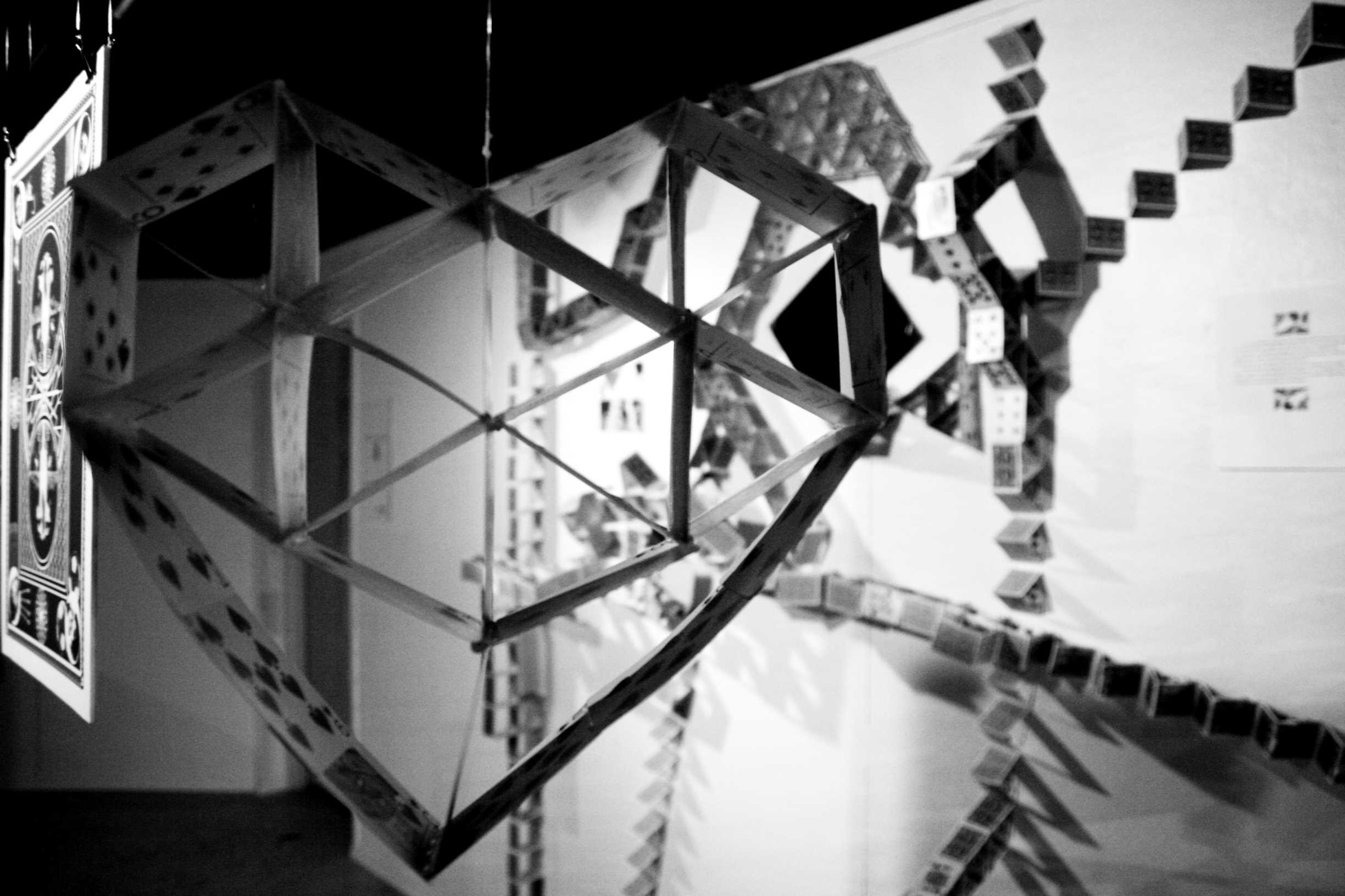
In the graphic design junior showcase “biographic,” Maroon art director Joe Fleming’s artwork comprised hundreds of playing crads attached to the walls of the Danna Student Center’s lower level art gallery. (Kevin Zansler/ The Maroon)

Graphic design senior Martha Heatherington’s artwork in the senior show “Unlimitedesign” raises awareness for the 30,000 species that go extinct every year. The senior showcase is currently on exhibit in New York City. (Tom Macom/ The Maroon)


