A new app has made its way on campus from Loyola, but some students aren’t finding it as useful as they hoped.
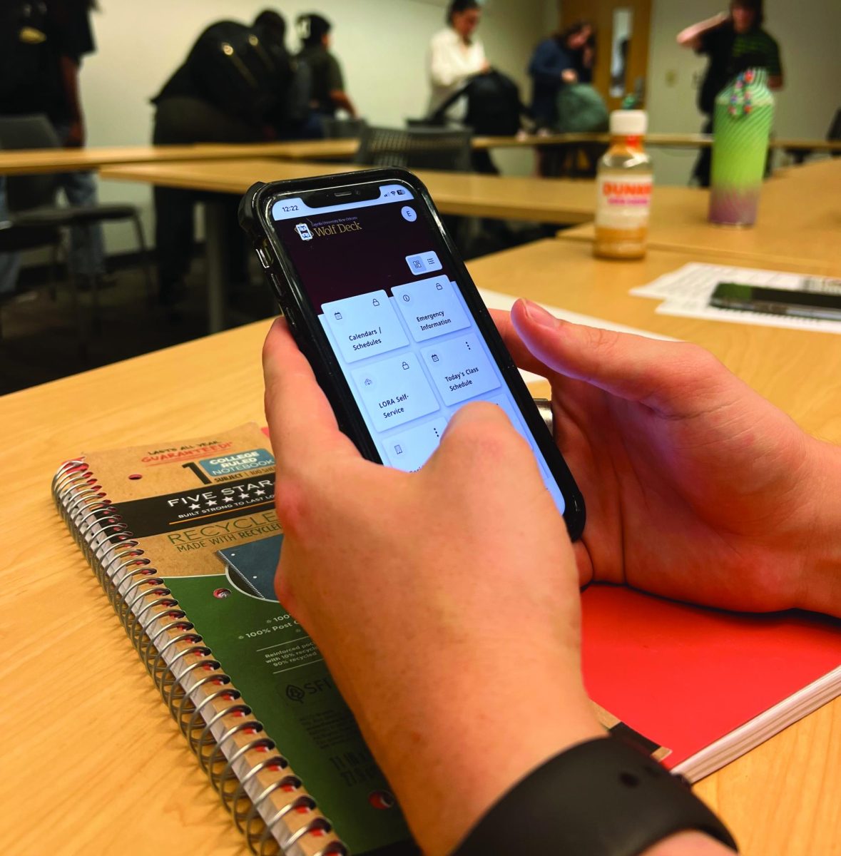
Loyola announced the launch of the new Wolfdeck app on Aug. 24. The app, which is available for both Android and Apple users, was designed to allow students to access important university information easily from their mobile devices.
According to Alan Schomaker, Loyola’s chief information officer, the app exists as an extension of Ellucian. Ellucian is the new system which replaced Loyno Single Sign-On and provided new programs and features such as Loyola Self-Service.
“The app is another tool that students can choose to help them bookmark and gain access to regularly viewed content. Plus it’s mobile friendly,” said Schomaker.
Schomaker said the app was tested by student volunteers throughout its development for the purpose of receiving feedback and adjusting the app accordingly.
Despite these attempts, some students have still felt let down by the final product.
Journalism sophomore Kaliegh Barrileaux said she was initially excited by the idea of having an easier avenue to access all of her university information.
Unfortunately, the app did not live up to her expectations.
“The app, for me at least, was a major letdown,” Barrileaux said.
Instead of streamlining the process of reaching important student information, Barrileaux said the app included even more barriers to access than the regular browser function.
“It actually made things much more complicated,” said Barrileaux.
According to Barrileaux, the app did not live up to its original purpose of making Ellucian’s vital university features more easily accessible to students. She even argued that it has had the opposite effect by making students jump through dozens of hoops just to access features such as Loyola’s Single Sign On, or Loyola Self-Service.
Barrileaux said her biggest issue was that she would have to sign in every time she opened it instead of saving the login information.
“I feel bad because I know it takes time to set up an app like that. However, I don’t see anyone seriously using it over just a browser,” said Barrileaux.
However, there is still hope for improvements to be made. According to Schomaker, the app was designed to include a feedback card for students to suggest ideas to make the app more user-friendly. This card is monitored daily by Loyola staff so that the app may be adjusted according to student responses.
Barrileaux said even with the app’s downs, she still holds hope for its future.
“I do look forward to more updates in the future, the app does have potential to be great,” said Barrileaux.


